
Dividend Yield vs Drawdown: a simple approach to compare stocks
Motivation
The aim of this analysis is to answer a very simple question:
How would you compare high-dividend stocks without ignoring the real risk I’m taking?
Many times, we focus only on dividend yield, while we ignore something equally important:
📉 how deep a stock can fall before recovering.
Instead of investing in complex models or forecasts, I deliberately chose a practical and reproducible approach:
- Real dividends
- Historical drawdowns
- Exchange-level comparison
Dataset collection and preparation
The first step was to get and unify datasets by market:
- NYSE
- LSE
- TSX
For each exchange, I worked with two types of files:
*_features.csv: general metrics (price, drawdown, volatility, etc.)*_div_events.csv: dividend events (payments, frequency, amounts)
The workflow was intentionally simple:
- Read the CSV files
- Clean inconsistent columns
- Unify schemas
- Build a final dataframe comparable across markets
🎯 Goal: to have a homogeneous dataset, not perfect, but good enough for comparative analysis.
A deliberately simple approach
I focused on just two key variables:
📈 Dividend Yield
- How attractive the passive income is
- Based on real trailing-twelve-month dividends
📉 Max Drawdown
- The worst historical decline
- How psychologically painful the investment can be
This helped me cut unnecessary noise and focus on one core question:
Am I being fairly compensated for the risk I’m taking?
Data cuts and clear rules
To avoid bias:
- I selected the top dividend yield stocks per exchange
- Excluded securities with extreme drawdowns
- Normalized comparisons across markets
I’m not trying to find “the best stock”, but rather patterns:
- Exchanges with better risk-to-income balance
- Risk concentration zones
- Outliers that look attractive but hide severe drawdowns
Visualization
This is where the analysis becomes much clearer.
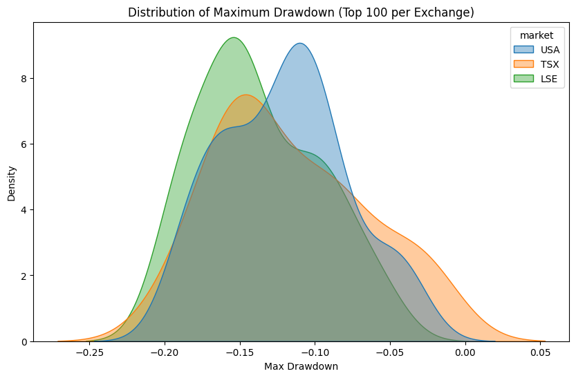
Max drawdown distribution by exchange

This visualization helped me understand:
- Which markets concentrate more risk
- Where drawdown tails are longer
- Where high yields usually come with deep losses
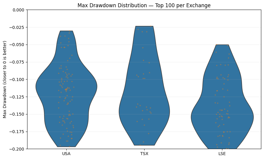
Final comparison by exchange

This second chart reinforces an important idea:
- Not all high yields are equal
- Some exchanges penalize risk more than others
- Market context matters as much as the dividend itself
Final insights
Slides
use arrow to navigate through the slides
Comparative Analysis: NYSE vs TSX and LSE Through Dividends and Drawdowns
In this analysis, I made a clear methodological decision: to focus only on the best loss scenarios, meaning I selected stocks with a maximum drawdown greater than or equal to −20% within the Top 100 stocks per exchange.
The objective of this filter was to identify assets with strong performance while avoiding severe capital losses, and under this constraint, compare the NYSE (United States), TSX (Canada), and LSE (United Kingdom) in terms of risk and income generation.
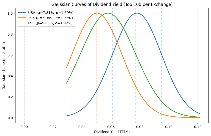
1. Average Dividend Yield and the Gaussian Distribution
By constructing a Gaussian (normal) distribution for the Dividend Yield (TTM), several patterns emerge:
NYSE shows the highest average dividend yield compared to TSX and LSE.
Even after filtering for stocks with lower drawdowns, the U.S. market maintains a superior mean.
The dispersion (σ) remains relatively controlled, suggesting that this is not driven by a few outliers, but rather by a consistent distribution.
This is an important insight: even under conservative capital-preservation criteria, NYSE remains competitive in income generation.
2. Drawdown Analysis: Lower Capital Loss Overall
When analyzing the Maximum Drawdown distribution, not only from my personal experience as a Latin American investor with some exposure to the U.S. market, but also from the data itself, the results are clear:
NYSE exhibits lower average drawdowns compared to TSX and LSE (after applying the exchange-level filter).
The density concentrates around less negative values, indicating better capital protection during market downturns.
TSX and LSE show longer tails toward deeper losses, reflecting higher exposure to adverse scenarios.
This reinforces the idea that NYSE not only pays higher dividends on average, but also penalizes capital less during periods of market stress.
3. Practical Implications as an Investor
From a realistic investment perspective:
NYSE appears more attractive for short- and medium-term strategies, where the balance between dividend income and drawdown control is critical.
Market liquidity, depth, and the diversity of financial instruments clearly work in favor of the U.S. market.
However, the analysis also confirms that concentration in a single market is not optimal.
This is where strategic diversification becomes essential.
4. The Role of More Stable Markets Like Canada (TSX)
Although TSX delivers lower average returns, it offers other valuable characteristics:
Greater structural stability
Exposure to defensive sectors (financials, energy, infrastructure)
Lower relative volatility during certain market cycles
For this reason, allocating a portion of long-term savings to more stable markets such as Canada makes sense, not as a growth engine, but as a risk anchor within the portfolio.
Conclusion
This analysis confirms an important takeaway:
NYSE combines higher returns with lower capital losses even under conservative filters, making it well-suited for short- and medium-term strategies.
TSX, while less profitable, plays a key role as a defensive diversifier.
Rather than choosing a single “better” exchange, the real value lies in allocating capital based on the role each market plays within the portfolio.
Next Steps
In future posts, I plan to share one of the strategies that has allowed me to sustain myself as an international student in Canada, that has worked well in terms of both dividends and drawdowns. Through this strategy, I am able to cover at least one-third of my expenses without breaking the savings and investment routines I established back in my home country.
Reference notebook
For now, I’m not embedding the notebook directly into my blog, please check my notebook you can reproduce all data an graphs shown here.
👉 Full analysis notebook
View notebook on GitHub
References
- https://www.amazon.com/gp/product/B0BB5DDB1Q
- https://github.com/Quantreo/2nd-edition-BOOK-AMAZON-Python-for-Finance-and-Algorithmic-Trading?tab=readme-ov-file
- https://www.sea-stat.com/wp-content/uploads/2021/05/Yves-Hilpisch-Python-for-Finance_-Mastering-Data-Driven-Finance-Book-OReilly-2018.pdf
- https://www.myjar.app/blog/financial-education/what-is-capital-erosion-and-how-does-it-affect-your-savings