
Statistics Fundamentals: Correlations and P-Value Models
🧠 Introduction
Understanding correlation is one of the first steps toward mastering data analysis.
Correlation tells us how strongly two variables move together — whether one increases as the other increases, decreases, or if there’s no relationship at all.
There are several ways to measure relationships depending on the type of data (continuous or categorical) and distribution assumptions.
Below are some of the most common methods and how they’re used in Python.
correlation
correletion is a statistical measurements that describe the behavior of two variables and how they are related to each other. but is good reember two flow before continues or take care each time you are working with correlation
flaws of correlation
1st Flaw: The correlation coefficient does not have units (e.g., “cubic feet per hour”).
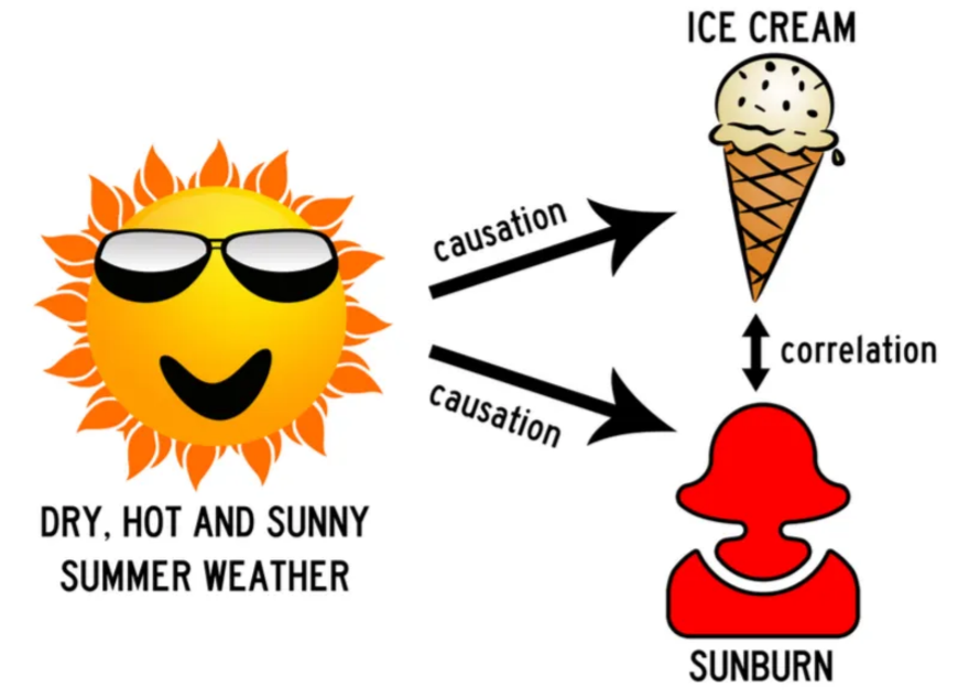
2nd Flaw: “Correlation does not imply causation”. lurke variable, like classical example ice-cream sales and shark attacks and violence and churchs, always the lurke variables is the behind the scenes making the correlatuion looks like there is a causation but in reality there is not.
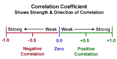
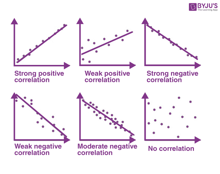
Correlation can reveal patterns, but it’s important not to check only on the correlation coefficient itself. Always look at the shape of the relationship in a graph the visual pattern often tells you more than the number alone. In this example, I’ll use scatterplots to illustrate the different forms of correlation, showing how variables can move together in positive, negative, or even no clear direction at all.
📊 1. Spearman Correlation
Used to measure monotonic relationships (when variables move in the same or opposite direction but not necessarily linearly).
from scipy.stats import spearmanr
corr, p_value = spearmanr(a, b)
When to use:
- Data are ordinal or not normally distributed.
- You only care about the ranking relationship.
Unlike Pearson correlation, which works with the actual numeric values,
Spearman correlation first converts all data into ranks before measuring the relationship.
When your variable is not continuous but ordinal (like income bins 1–8 or satisfaction levels 1–5),
Spearman still works great because those categories already behave like ranks.
For example:
| Income Bin | Label |
|---|---|
| 1 | Very Low |
| 2 | Low |
| 3 | Medium |
| 4 | High |
| 5 | Very High |
These bins have natural order, but not equal spacing — meaning the jump from bin 1 → 2 isn’t the same as 4 → 5.
That’s exactly where Spearman correlation shines.
It measures the monotonic trend (do higher bins tend to correspond to higher or lower outcomes?)
without assuming a straight-line (linear) relationship like Pearson does.
🧠 In short:
Spearman converts all values into ranks (or uses your ordinal bins directly)
and then measures how those ranks move together.
Perfect for data that is ordered but not perfectly linear.
📈 2. Pearson Correlation
Measures the strength of a linear relationship between two continuous variables.
from scipy.stats import pearsonr
corr, p_value = pearsonr(a, b)
When to use:
- Both variables are continuous and approximately normal.
- The relationship looks roughly linear.
let’s check a simple example applied to dataanalitics
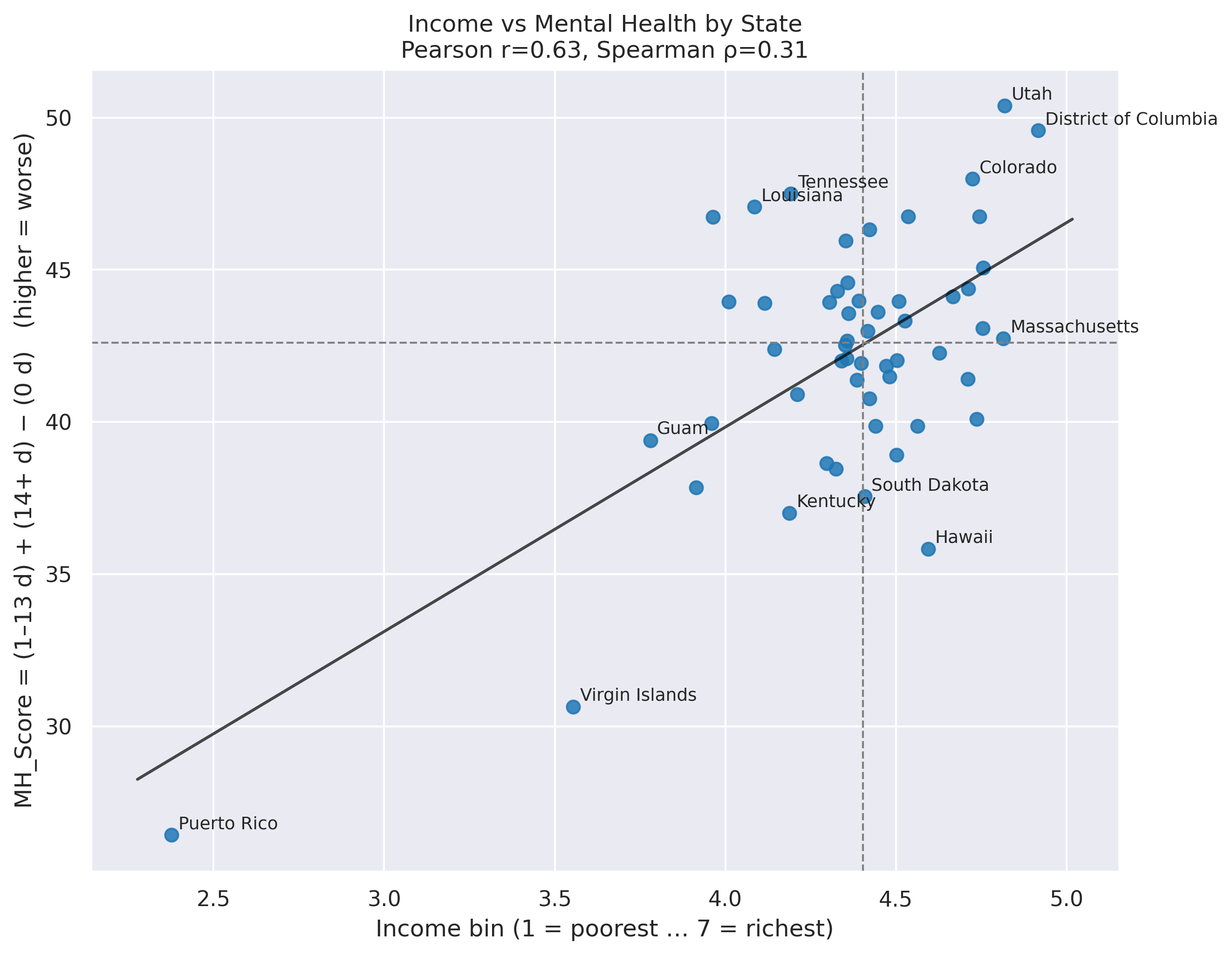
🧪 Spearman on BRFSS: Income vs. Mental-Health
We’ll estimate a correlation between income(in bins categorical 1-8) and mental-health scores using Spearman’s ρ.
This is ideal when income is ordinal (e.g., 1–8 bins) and the relationship may be non-linear.
Use the raw BRFSS rows (each respondent) with:
income_bin(ordinal 1–8, higher = higher income)mh_score(e.g., “mental health composite” or number of “bad MH days” higher = worst mental health, for this example we use MH_Score = (1–13 d) + (14+ d) )
import numpy as np
import pandas as pd
import matplotlib.pyplot as plt

# df  -> your MH table with columns: ["STATE_CODE","State","0 days poor MH","1-13 days poor MH","14+ days poor MH","MH_Score"]
# summary_df -> your income table with columns including ["_STATE","State","mean_bin"]

# keep only the columns we need and normalize names
mh = df[["STATE_CODE","State","MH_Score"]].copy()
inc = summary_df[["_STATE","State","mean_bin"]].rename(columns={"_STATE":"STATE_CODE"}).copy()

# ==== 1) Merge ====
both = mh.merge(inc, on=["STATE_CODE","State"], how="inner")

# (optional) keep only 50 states (drop DC & territories)
# both = both[~both["STATE_CODE"].isin([11,66,72,78])].copy()

# ==== 2) Correlations ====
pear = both[["mean_bin","MH_Score"]].corr(method="pearson").iloc[0,1]
spear = both[["mean_bin","MH_Score"]].corr(method="spearman").iloc[0,1]
print(f"Pearson r = {pear:.3f}  |  Spearman ρ = {spear:.3f}  (x: richer → higher, y: worse → higher)")

# ==== 3) Scatter (quadrants + trendline) ====
x = both["mean_bin"].to_numpy()
y = both["MH_Score"].to_numpy()
xm, ym = np.median(x), np.median(y)

plt.figure(figsize=(9, 7))
plt.scatter(x, y, s=45, alpha=0.85)

# OLS line (visual)
m, b = np.polyfit(x, y, 1)
xx = np.linspace(x.min()-0.1, x.max()+0.1, 200)
plt.plot(xx, m*xx + b, lw=1.5, color="black", alpha=0.6)

# quadrant medians
plt.axvline(xm, ls="--", lw=1, color="gray")
plt.axhline(ym, ls="--", lw=1, color="gray")

# label a few extremes
lab = pd.concat([both.nsmallest(5,"MH_Score"), both.nlargest(5,"MH_Score"),
                 both.nsmallest(3,"mean_bin"), both.nlargest(3,"mean_bin")]).drop_duplicates("State")
for _, r in lab.iterrows():
    plt.text(r["mean_bin"]+0.02, r["MH_Score"]+0.2, r["State"], fontsize=9)

plt.xlabel("Income bin (1 = poorest … 7 = richest)")
plt.ylabel("MH_Score = (1–13 d) + (14+ d) − (0 d)   (higher = worse)")
plt.title(f"Income vs Mental Health by State\nPearson r={pear:.2f}, Spearman ρ={spear:.2f}")
plt.tight_layout()
plt.show()

# ==== 4) Quick comparison table (top/bottom by MH) with income column ====
view = pd.concat([both.nsmallest(7,"MH_Score").assign(Group="Best 7 (MH)"),
                  both.nlargest(7,"MH_Score").assign(Group="Worst 7 (MH)")],
                 ignore_index=True) \
        .sort_values(["Group","MH_Score"], ascending=[True, True])

print(view[["Group","State","MH_Score","mean_bin"]].to_string(index=False, float_format=lambda v: f"{v:.1f}"))
slides
use arrow to navigate through the slides
📚 References
- underrated wikipedia https://en.wikipedia.org/wiki/Spearman%27s_rank_correlation_coefficient
- SciPy
statsdocumentation: https://docs.scipy.org/doc/scipy/reference/stats.html - Statsmodels documentation: https://www.statsmodels.org/stable/index.html
- Scikit‑learn user guide: https://scikit-learn.org/stable/user_guide.html
- “Practical Statistics for Data Scientists” (O’Reilly)
- https://byjus.com/maths/correlation/
- https://docs.google.com/presentation/d/1h5lD-rMfw0fAxGkx-6gWLJTQS0QFMfSTvz-WCvXSHNY/edit?slide=id.g39d1689f503_0_1#slide=id.g39d1689f503_0_1
- https://colab.research.google.com/drive/1AGhtvp7aM4nrY3y4Hq6wUnM19PbZkvz2?usp=sharing#scrollTo=irFtdbHNh0VP
- https://www.kaggle.com/datasets/ariaxiong/behavioral-risk-factor-surveillance-system-2022
- https://www.cdc.gov/brfss/annual_data/annual_2022.html
- https://www.cdc.gov/pcd/issues/2022/pdf/22_0001.pdf